Google Pixel Fold design details revealed
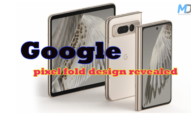
Last month, Google launched its first-ever foldable phone called Pixel Fold. They were also working on another foldable phone, but it wasn’t released. Two Google Product Managers recently gave an interview to Engadget, sharing more details about the Pixel Fold. Keep reading to find out more.
The interview shows how Google’s Pixel Fold is different from Samsung’s Galaxy Z Fold. Pixel Fold is smaller and shaped like a passport. Hwang, a product manager on the Pixel Fold team, says that Google wanted the phone’s outside screen to be useful, so users can do things quickly without opening the phone. Google focused on the outside screen first, unlike other brands that focus on the inside screen.
Hwang showed the Pixel Fold’s hinge, bezels, crease, and camera system. The team made a special hinge that moved to the device’s edge, making it thinner and allowing the interior and exterior screens to be different sizes. Google also created a phone that folds completely flat. Some people didn’t like the bezels on the interior display, but Hwang explained that they were used instead of an under-display camera for durability and water resistance. The bezels also provide a place to rest your hands. Instead of a noticeable crease, Google chose a hybrid design that looks like a water drop to minimize crease visibility.
Hardware and software are crucial for improving foldable phones. Andrea Zvinakis, a Product Manager, emphasized the significance of how the phone’s screen moves from open to closed and at any angle, known as continuity and posture. By detecting posture, the phone can offer a dual-screen interpreter mode where two people can see real-time translations of different languages on each side of the screen. Zvinakis also mentioned additional features like a taskbar, dual shade, and split-screen.


