Xiaomi replacing Mi Home Store branding with new logo
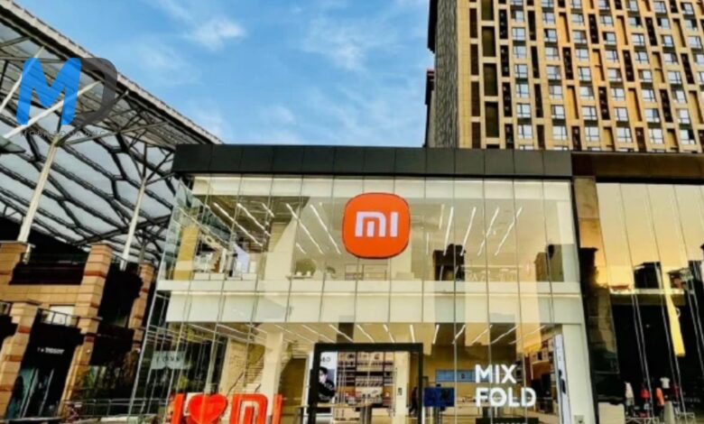
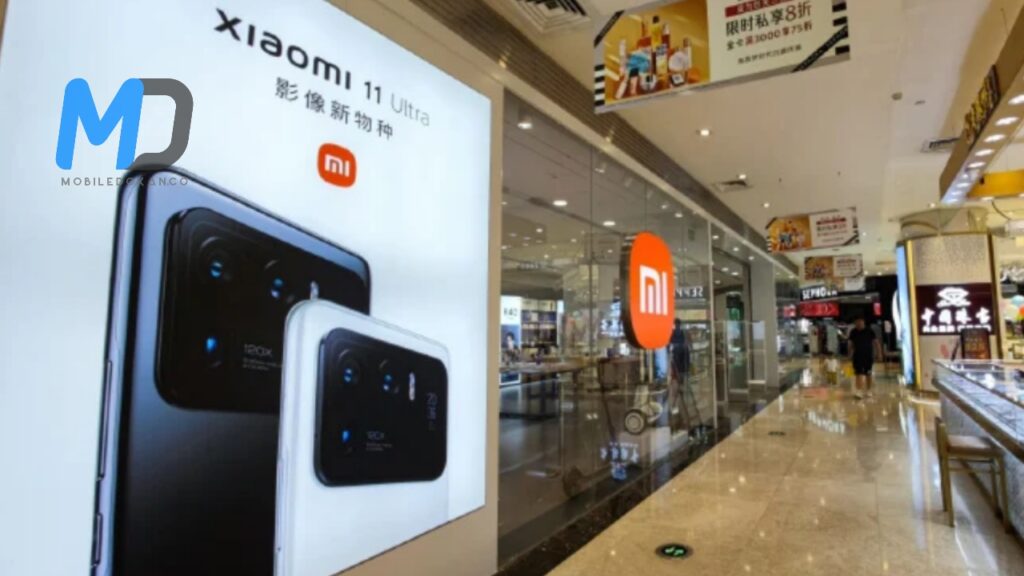
The company of Xiaomi replacing Mi Home Store branding with new logo. Isn’t it a shocking news to you? The famous tech giant Xiaomi revealed at the end of the month that they start replacing Mi Home Store branding with new redesigned logo and new typography. The remarkable changing was confirmed by Lu Weibing, Partner at Xiaomi Group. He is also the President of Xiaomi China, and General Manager of the Redmi brand.
During Spring New Product Launch event on 30th March, the new logo unveiled by Lei Jun, Founder and CEO of Xiaomi. The logo designer name was Kenya Hara, a professor of Musashino Art University and the President of the Nippon Design Center (NDC).
Xiaomi replacing Mi Home Store branding with new logo
For this new brand, xiaomi has long gone with rounded corners much like what you have visible on a few icon packs. So you have a squircle in place of the vintage emblem that is a rectangular. Xiaomi says the clothier used the “superellipse” mathematical system for the layout and had to modify the variables to get a visually most effective dynamic balance and an excellent balance among a rectangular and a circle.
Xiaomi confirmed the color of the logo remains unchanged. The logo must go on to use orange as its corporate color. Although, it will use Black and Silver variants of the logo as supplemental colors for high-end products. It was the 5000th Mi Home Store in China in the city of Shenyang.


